
- About the Journal
- Editorial Board
- Review Process
- Author Guidelines
- Article Processing Charges
- Special Issues
- Indexing
- Current Issue
- Past Issue
 Journal of Comprehensive Nursing Research and Care
Journal of Comprehensive Nursing Research and Care Volume 11 (2026), Article ID: JCNRC-225
https://doi.org/10.33790/jcnrc1100225Research Article
Beyond Words: Designing Effective Graphical Abstracts for Research Articles
Ayla Gürsoy
Professor, Faculty of Health Sciences, Department of Nursing, Antalya Bilim University, Turkey.
Corresponding Author Details: Ayla Gürsoy, Professor, Faculty of Health Sciences, Department of Nursing, Antalya Bilim University, Turkey.
Received date: 26th December, 2025
Accepted date: 05th March, 2026
Published date: 07th March, 2026
Citation: Gürsoy, A., (2026). Beyond Words: Designing Effective Graphical Abstracts for Research Articles. J Comp Nurs Res Care 11(1):225.
Copyright: ©2026, This is an open-access article distributed under the terms of the Creative Commons Attribution License, which permits unrestricted use, distribution, and reproduction in any medium, provided the original author and source are credited.
Abstract
The rapid growth of scientific literature has made it increasingly challenging to raise the profile of research outputs and communicate them effectively to target audiences. In digital academic environments, researchers are expected to produce high-quality scientific content while presenting it in an engaging and easily understandable way. Graphical abstracts (GAs) provide a structured visual summary of research findings through diagrams, symbols, and concise text. They enhance both visibility and accessibility while facilitating the rapid comprehension of key findings. Furthermore, GAs support the broader dissemination of research and strengthen engagement on digital and social media platforms. Rather than replacing traditional text-based abstracts, they serve as effective entry points that guide readers toward the full manuscript. To enhance the communicative effectiveness and scientific value of GAs, this article discusses fundamental design principles and proposes a guiding framework. This framework emphasises clarity, visual balance, consistent narrative structure, and audience-centred design. These elements are highlighted as critical factors in increasing the overall impact of GAs in scientific communication.
Keywords: Design Principle, Graphical Abstract, Research Dissemination, Scientific Communication, Visual Design.
Introduction
The rapid increase in the number of articles in scientific publishing is making it increasingly difficult to effectively convey research results to the target audience. Especially in today's world, where information is consumed quickly and superficially on digital platforms, traditional text abstracts often fail to capture the reader's attention. In this context, GAs stand out as a communication tool that enables readers to quickly grasp the key messages of the research within a visual structure [1,2].
A GA is a concise representation of the research question, methods, key findings, and conclusions using diagrams, symbols, short texts, and visual hierarchy. The purpose of this visual structure is not to replace the entire article but to direct the reader to the full text [3,4].
Graphic abstracts present complex data in a simplified structure thanks to their visual layout. This strengthens the initial impression of the study, especially for readers who are pressed for time or unfamiliar with the subject [4,5]. In addition, GAs increase the visibility of research and support its dissemination through alternative impact metrics (such as Altmetric and PlumX) thanks to formats suitable for sharing on social media and digital academic platforms [6-8].
The use of GAs in clinical and experimental research has the potential to facilitate the transfer of findings into practice. The ability of readers to grasp the main output of the study at a glance through GAs has the potential to accelerate the integration of scientific knowledge into clinical decision-making processes [3,4,9].
Despite all its advantages, the graphic summary carries certain methodological and communicative risks. Over-simplification of research findings can lead to misinterpretations that are disconnected from context or misleading. Readers evaluating a paper based solely on the GA without reading the entire article may misunderstand or misinterpret the scientific content [10,11]. Furthermore, the lack of standards for GAs across journals leads to heterogeneity in terms of layout and content [9,12,13].
Despite the increasing adoption of graphical abstracts in scientific journals, a lack of comprehensive guidelines that systematically link design principles to practical application considerations persists, particularly in the health sciences. This article addresses the fundamental design principles for developing graphical abstracts within the context of health sciences and aims to provide a guiding framework to support researchers in creating clear, coherent, and impactful graphical abstracts.
Design Principles for Graphical Abstracts
Creating high-quality GAs requires knowledge of design principles and establishing a balanced relationship between content and visuals [4,14,15]. Achieving the purpose of a graphical abstract largely depends on clarity and simplicity. Four fundamental principles to follow when planning the design of a graphical abstract are presented in Figure 1 [16]:
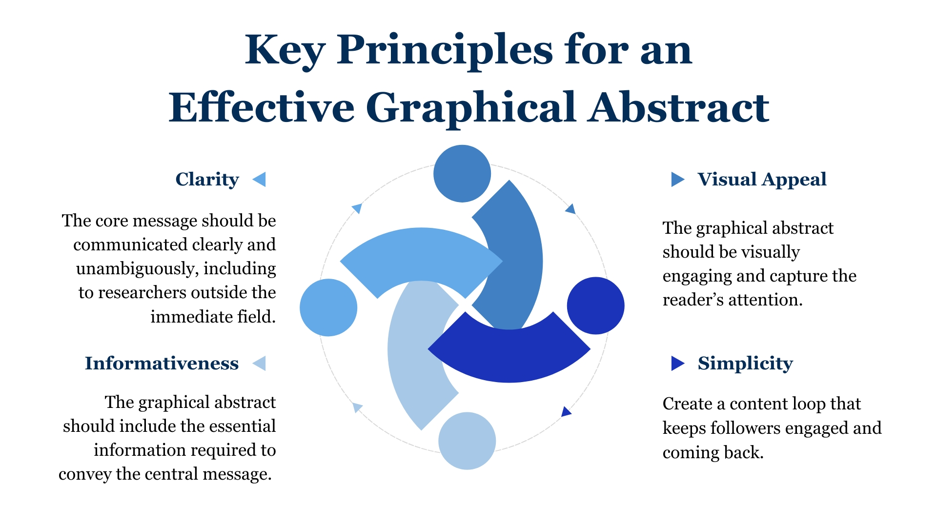
Figure 1. Overview of key principles guiding clarity, simplicity and visual effectiviness in GAs design
Layout
The graphical abstract usually follows the text abstract. The title of the research, the journal name, and the journal logo should be placed at the top of the graphical abstract; the author's name and reference information about the article should be placed at the bottom.
The area and size where the GA will be placed should be determined before starting the design. In journals and websites, GAs are usually square, rarely rectangular. One of the most commonly used formats in health science journals is the three-column layout (Figure 2A) recommended by Elsevier, consisting of sample, methods, and results [2,17]. This structure is particularly suitable for cohort studies. A two-step format of the same layout is preferred for randomised controlled trials (Figure 2B). More flexible layouts can be used in review articles [10,11]. When choosing a layout, consideration should be given to how the visual space can be used most effectively. An example of three-column GAs layout is presented in Figure 3A, whereas a two coulmn layout is illistrated in Figure 3B.
The structure of a graphical abstract (GA) consists of four areas (Figure 4) [7,10,11]:
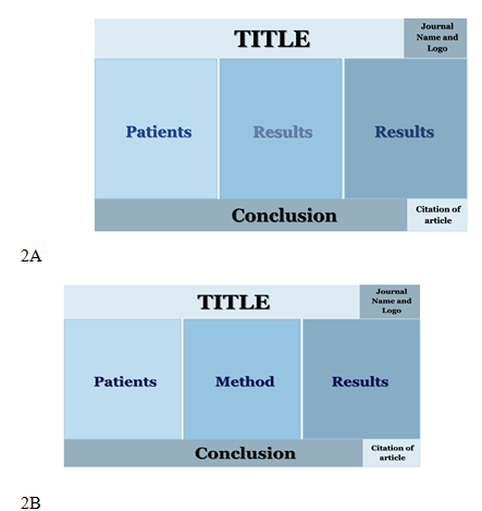
Figure 2A-B. Illustration of content organization and visual hierarchy to support rapid comprehension
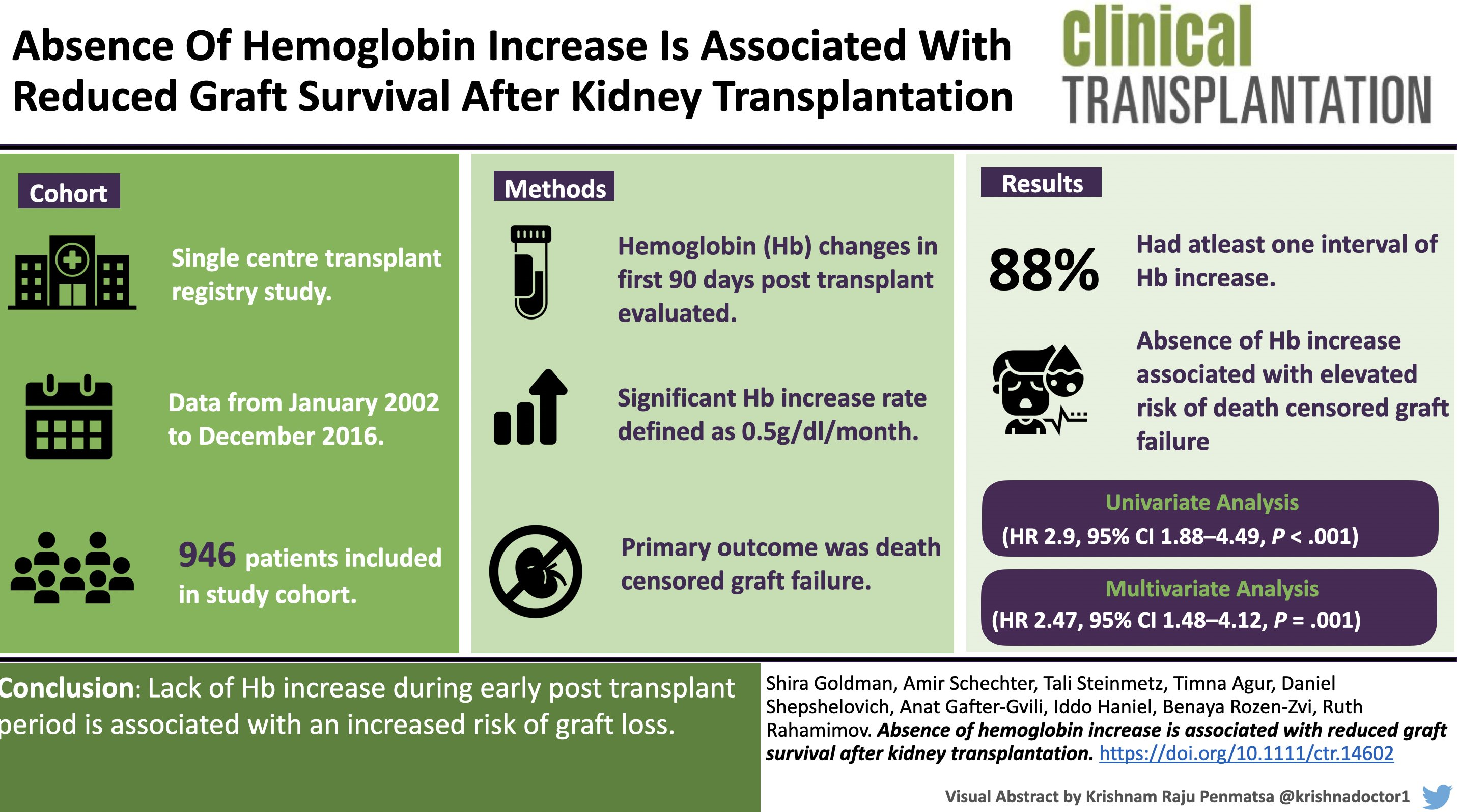
Figure 3. Examples of a two and three-column graphical abstract layout
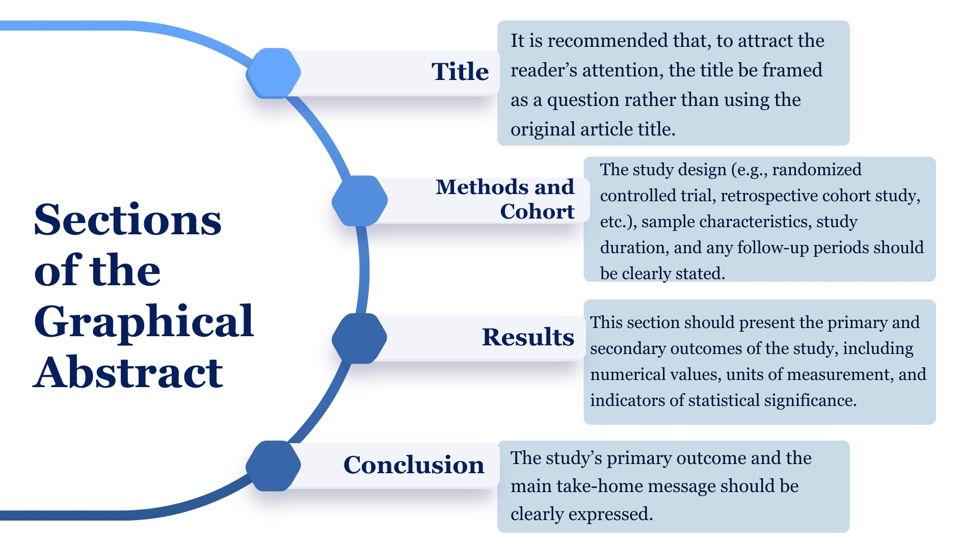
Figure 4. Presentation of essential sections contributing to coherent visual narration
Different programs can be used to create a graphical abstract design. Microsoft PowerPoint, in particular, is a widely used program with a user-friendly interface. Another option is Mind the Graph (https:// mindthegraph.com), a web-based subscription service that offers predesigned templates and visual elements. Other web-based graphic design tools, such as Biorender (https://biorender.com) and Canva (https://www.canva.com), can also be used [2,4,17]. The most proficient software for creating the design can be selected.
Flow
The reading direction of the summary should follow the visual hierarchy that progresses from left to right and top to bottom, consistent with the textual flow of the article [16].
Arrows and Lines
Arrows and lines are used to direct the flow and relationships within a graphic summary [18]. Arrows and lines have their own specific meanings (Figure 5). For example, a continuing arrow represents a result, while blind arrowheads typically represent obstruction. The meanings of arrow types should be consistent and should not cause visual confusion [17].
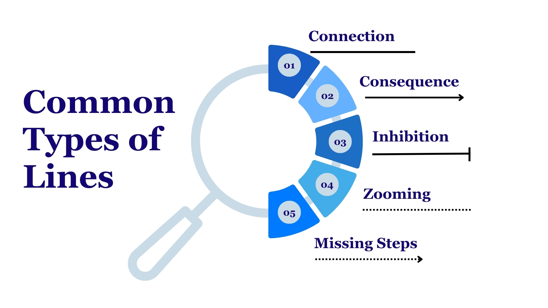
Figure 5. Examples of line usage to represent relationship and logical flow in GAs
Numbers
Numbers function as guides that enable the reader to follow multistep processes in sequence. Particularly useful in complex layouts, numbers, like arrows, should support the reading direction from left to right and top to bottom [16].
Symbols, Pictures and Pictograms
Symbols are graphical tools with specific meanings that facilitate easy recall and rapid communication of information. Therefore, it is recommended to use 2D symbols rather than 3D symbols, as the latter can distract the reader and complicate the summary [7]. Again, to facilitate focus, flat, single-colour symbols should be used rather than line-based symbols. Symbols should be sourced from the same source to ensure a similar overall appearance, i.e., the same line width, colour scheme, and level of detail. The icons used should not require copyright and should eliminate the need for attribution. Free sources such as PowerPoint, Pixabay, and The Noun Project are available as icon sources [16,17].
Graphics
When selecting graphics, simple graphics that provide the most understandable information in a short time should be preferred. In this regard, a simple graphic containing only a few data points or categories would be the most appropriate choice (Figure 6) . Axis labels and detailed explanations, which we are familiar with in articles, are generally not needed in GAs [16,17].
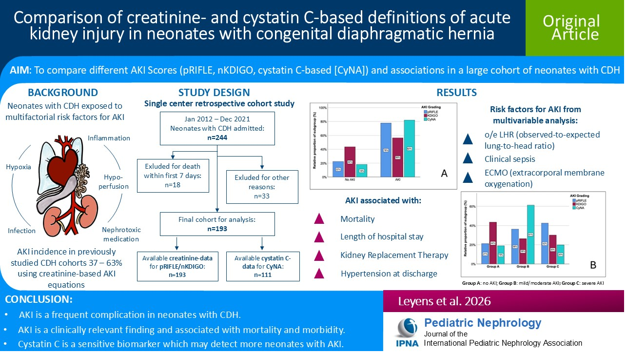
Figure 6. Sample praphic used in a graphical abstract
Graphical abstract reprinted from Leyens J et al [19] “ Comparison of creatinine-and cystatin C–based definitions of acute kidney injury in neonates with congenital diaphragmatic hernia”, Pediatric Nephrology under the Creative Commons CC BY License.
Colour Usage
Colours should be used not only for aesthetic purposes but also as a means of encoding information. For quantitative data, different shades of a single colour should be used; for categorical data, a limited number of contrasting colours should be preferred. Excessive use of colour should be avoided, and a limited and harmonious colour palette should be selected. Using multiple colours can make the summary visually overwhelming and cause important information to be lost [4,17]. Programs such as Adobe Colour, Coolors, Colourspace, and ColorMagic use artificial intelligence and text commands to generate colour palettes consisting of five or six colours based on keywords. A harmonious colour palette increases readability by minimising distractions through visual consistency. To increase accessibility, colourblind-friendly palettes should be preferred in graphic summaries [16,17]. Examples of effective colour usage in GAs are presented Figure7 A, B and C.
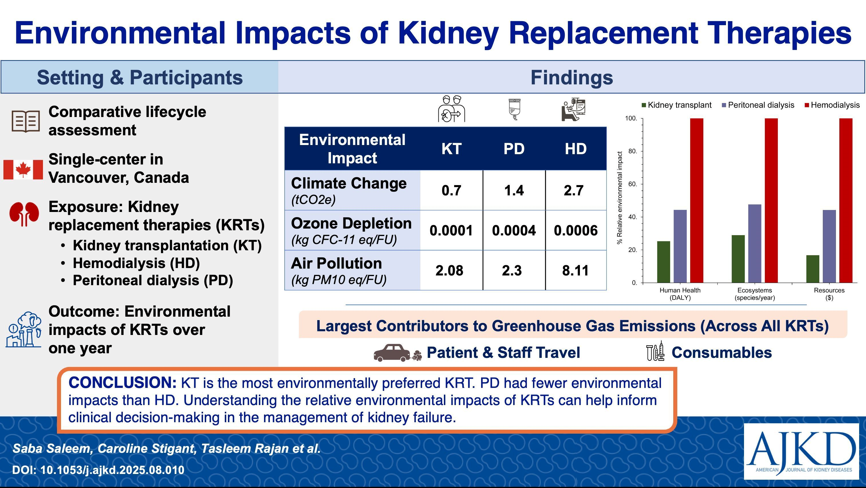
Figure 7. Examples appropriate colour usage in GAs
Text
Although minimal, text is an important part of the graphic summary. It also plays an important role in providing explanations that would not be possible in figures or in resolving ambiguities. To determine the content and terminology of the text to be used in the graphic summary, the target audience must first be identified [11]. This is because the terminology used will differ for readers who are healthcare professionals and those who are not. The text content should use simple, understandable language, avoiding jargon, abbreviations, and technical terms [3,17]. Font size affects the clarity and readability of your graphic summary. Text that is too small obscures meaning, while text that is too large can overshadow other visual elements. When using text, one size should be used for headings and a smaller size for the rest of the text; however, a third size should be used only if necessary. Preferred fonts are serif and sans-serif, while Comic Sans MS and Papyrus should be avoided (Figure 8) [17]. Journal guidelines should be checked before adding text to the graphical abstract.
Finally, feedback should be obtained after the graphic summary has been created. Feedback will ensure that the design of the graphic summary is clear and understandable [2,3].
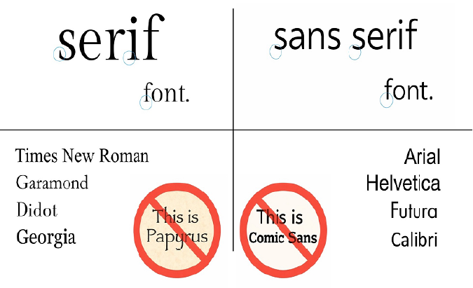
Figure 8. Comparison of front styles highlighting their impact on readability and visual clarity
Practical Consideration and Challenges
Despite their increasing use, researchers may encounter various practical difficulties when applying graphic abstracts across different disciplines. These difficulties are generally related not to the merits of graphic abstracts themselves, but to uncertainties concerning limitations in design expertise, time constraints, and journal-specific expectations [4,10]. In health sciences, additional concerns may arise regarding the risk of oversimplification and the potential for misrepresentation of complex clinical findings [9]. Furthermore, differences in disciplinary norms and the lack of standardised guidelines across journals can complicate the consistent and effective use of graphic abstracts. Overcoming these challenges requires increased awareness of design principles and greater alignment between visual communication practices and disciplinary contexts [4].
Furthermore, differences in journal-specific guidelines, including variations in format, content requirements, and submission policies, can affect how graphic abstracts are designed and implemented, potentially limiting the generalizability of the proposed framework [2].
Conclusion
Graphic summaries stand out as an effective presentation format that responds to the demands of the digital age in scientific communication. Through their visual appeal and concise structure, they bridge the gap between complex scientific content and diverse target audiences. However, given the potential risk of oversimplification and misinterpretation, GAs must be designed thoughtfully and applied with methodological awareness. Developing shared standards and disseminating evidence-informed design principles can support the effective use of GAs while preserving scientific accuracy and integrity. Future research should focus on establishing disciplinespecific GAs guidelines and empirically examining their impact on reader engagement, knowledge translation, and research visibility across different scientific fields. Such efforts will contribute to the more consistent, responsible, and impactful integration of GAs into scholarly communication.
Conflict of Interest:
The author(s) declare that they have no conflict of interest related to this article.
List of Abbreviations
GA: Graphical Abstract
References
West, C. C., & Lindsay, K. J. (2020). Promoting your research using infographics and visual abstracts. Journal of Plastic, Reconstructive & Aesthetic Surgery, 73, 2103–2105. View
Lee, J., & Yoo, J.J. (2023). The current state of graphical abstracts and how to create good graphical abstracts. Science Editing, 10, 19–26. View
Harder, N. (2023). Graphical abstracts for research papers: Why you need one and how to create it. Clinical Simulation in Nursing, 79, A1–A2. View
Jeyaraman, N., Jeyaraman, M., Ramasubramanian, S., Balaji, S., & Nallakumarasamy, A. (2025). Visualizing medicine: The case for implementing graphical abstracts in clinical reporting. World Journal of Methodology, 15(2), 95–96. View
Krukowski, R. A., & Goldstein, C. M. (2023). The potential for graphical abstracts to enhance science communication. Translational Behavioral Medicine, 13, 891–895. View
Ibrahim, A. M., Lillemoe, K. D., Klingensmith, M. E., & Dimick, J. B. (2017). Visual abstracts to disseminate research on social media: A prospective, case-control crossover study. Annals of Surgery, 266(6), e46–e48. View
Millar, B. C., & Lim, M. (2022). The role of visual abstracts in the dissemination of medical research. Ulster Medical Journal, 91(2), 67–78. View
Kim, Y., Lee, J., Yoo, J.J., Jung, E.A., Kim, S. G., & Kim, Y. S. (2022). Seeing is believing: The effect of graphical abstracts on citations and social media exposure. Journal of Korean Medical Science, 37, e321. View
Ibrahim, A. M. (2018). Seeing is believing: Using visual abstracts to disseminate scientific research. American Journal of Gastroenterology, 113(4), 459–461. View
Jeyaraman, M., Ratna, H. V. K., Jeyaraman, N., Maffulli, N, Migliorini, F, Nallakumarasamy, A., & Yadav, S. (2023). Graphical abstract in scientific research. Cureus, 15(9), e45762. View
Jeyaraman, M., & Vaishya, R. (2023). Attract readers with a graphical abstract: The latest clickbait. Journal of Orthopaedics, 38, 30–31. View
Bredbenner, K., & Simon, S. M. (2019). Video abstracts and plain language summaries are more effective than graphical abstracts and published abstracts. PLOS ONE, 14(1), e0224697. View
Agrawal, S., & Ulrich, P. (2023). A picture is worth 1000 words: Teaching science communication with graphical abstract assignments. Journal of Microbiology & Biology Education, 24 (1), e00208–22. View
Zong, Q., Huang, Z., & Deng, Z. (2023). Do graphical abstracts on a publisher’s official website have an effect on articles’ usage and citations? Learned Publishing, 36, 266–274. View
Gilling, R., Scandlyn, M., & Hesp, B. (2024). Prevalence and characteristics of graphical abstracts in a specialist pharmacology journal. Scientometrics. View
Oliverio, M., and Wright, D. E., (2025). The art of the graphical abstract a visual approach to scientific storytelling. FEBS Lett. 599(24):3549-3562. View
Jambor, H. K., & Bornhäuser, M. (2024). Ten simple rules for designing graphical abstracts. PLOS Computational Biology, 20, e1011789. View
Kahneman, D., & Tversky, A. (Eds.) (2000). Choices, Values and Frames. Cambridge University Press. View
Leyens, J., Gerschlauer, J., Berg, C., Strizek, B., Mueller, A., Kipfmueller, F., & Schroeder, L. (2026). Comparison of creatinine-and cystatin C–based definitions of acute kidney injury in neonates with congenital diaphragmatic hernia. Pediatric Nephrology, 1-15. Advance online publication. View
Saleem, S., Stigant, C., Rajan, T., Hewage, K., Sadiq, R., MacNeill, A. J., & Nguan, C. (2026). Environmental impacts of kidney replacement therapies: A comparative lifecycle assessment. American Journal of Kidney Diseases, 87(1), 65– 74.e1. View
An, K. R., Harik, L., Rahouma, M., Caldonazo, T., Habib, R. H., Dhingra, N. K., … & Gaudino, M. F. L. (2025). Trends and outcomes of mechanical circulatory support in acute myocardial infarction and cardiogenic shock patients undergoing coronary artery bypass grafting. The Annals of Thoracic Surgery. Advance online publication.
Cantoni, V., Casula, E. P., Tarantino, B., Cupidi, C., Huber, N., Altomare, D., … & Borroni, B. (2025). Home-based gamma transcranial alternating current stimulation in patients with Alzheimer disease: A randomized clinical trial. JAMA Network Open, 8(12), e2546556. View